Faridah Ayelabegan Portfolio

Product Designer · Design Specialist · UI/UX Designer

I design thoughtful interfaces and evaluate digital experiences with a sharp eye for clarity, quality, and usability.

I’m Faridah Yetunde Ayelabegan — a Product, UI/UX and Web Designer focused on product thinking, design critique, and AI-assisted evaluation work. My portfolio is structured to show not just what I built, but how I think: the decisions I make, the issues I spot, and the standards I apply when reviewing interfaces.

Profile photo
Focus Product Design · UI/UX · Web & Mobile
Open to Design Evaluation · AI · Creative Tech
Availability Open to remote & global opportunities

Design Lens

Strong visual hierarchy, spacing systems, typography, usability, accessibility, and consistency checks.

Evaluation Work

Comfortable assessing AI outputs, reviewing design prompts, and writing precise UI observations with rationale.

UI/UX Strength

Able to transform complex ideas and user needs into clean, intuitive interfaces through user research, wireframing, prototyping, responsive design, usability evaluation, and thoughtful visual refinement.

Working Style

Structured, detail-oriented, and comfortable documenting critique, reasoning, edge cases, and improvement paths.

Selected Work

A selection of work across web and digital products.

A curated look at some of the digital products and interfaces I’ve worked on, spanning web, mobile, and product experiences. These previews highlight the visual direction and product thinking behind my work, with the full projects available through my portfolio.

EservOne admin dashboard

Case Study 01

EservOne — Service Marketplace

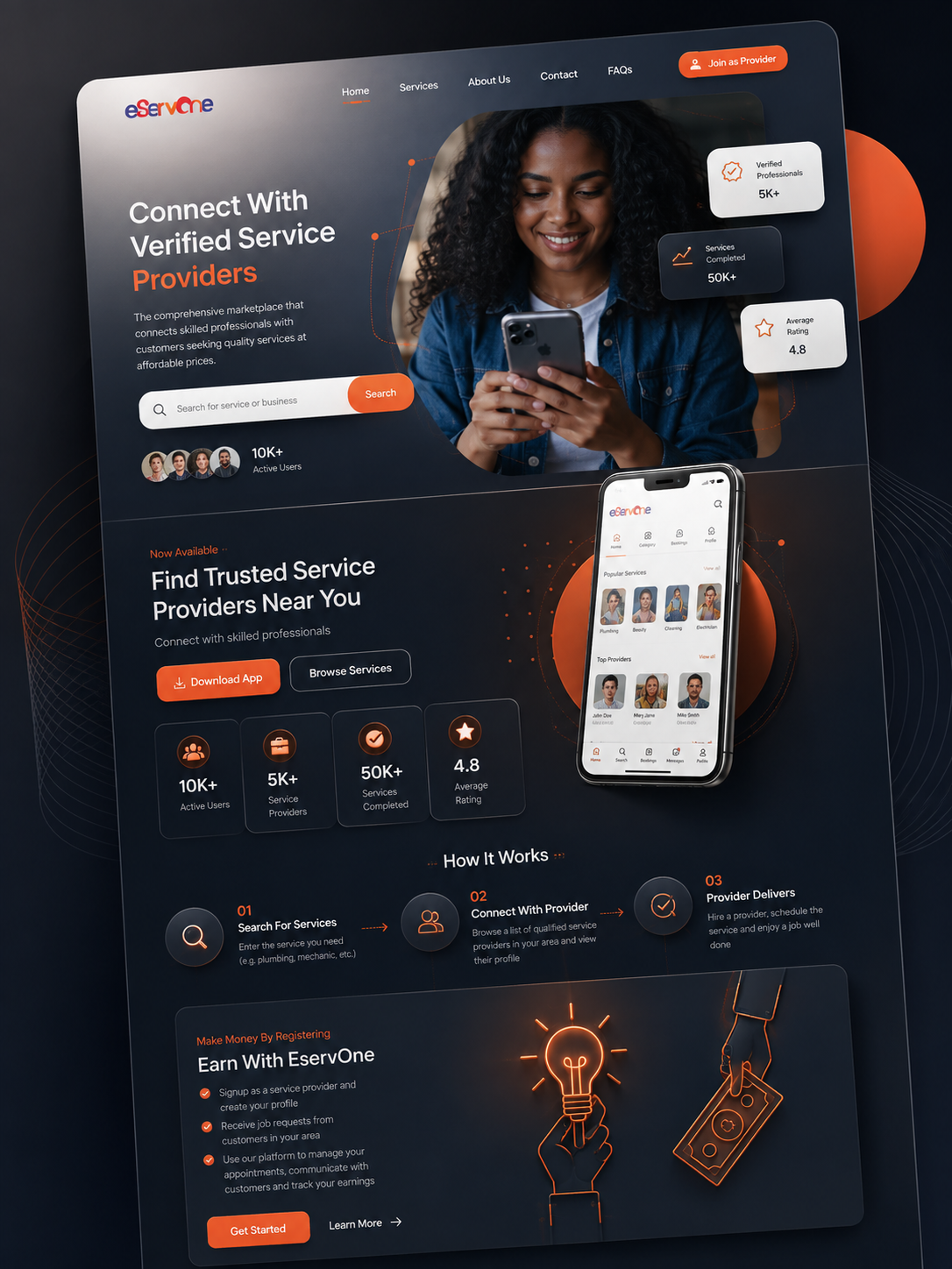
EservOne is a digital service marketplace designed to connect customers with verified service providers. The experience brings service discovery, provider profiles, booking, communication, reviews, and secure payments into one streamlined platform for both customers and professionals.

Role

Product & UI Designer

Focus

Service discovery, trust, user flows, responsive web & mobile experience

Tools

Figma, Prototyping, Responsive Design, Design Systems

Problem

Finding reliable service professionals can involve uncertainty around quality, pricing, availability, and trust. The platform needed to make service discovery easier while giving customers enough information to confidently choose and engage a provider.

Approach

I focused on creating a clear service discovery experience with intuitive navigation, recognizable service categories, provider verification cues, ratings, reviews, and straightforward calls to action. The experience was designed to work consistently across web and mobile touchpoints.

Outcome

The resulting experience presents EservOne as a complete marketplace where customers can discover and connect with professionals while providers can showcase their services, manage customer relationships, and grow their business.

Design Preview

This is a selected mockup and visual glimpse of the EservOne project. The preview highlights the overall design direction and selected product screens rather than the complete case study.
View Full Portfolio
BlazeX

Case Study 02

BlazeX — Customer Feedback Platform

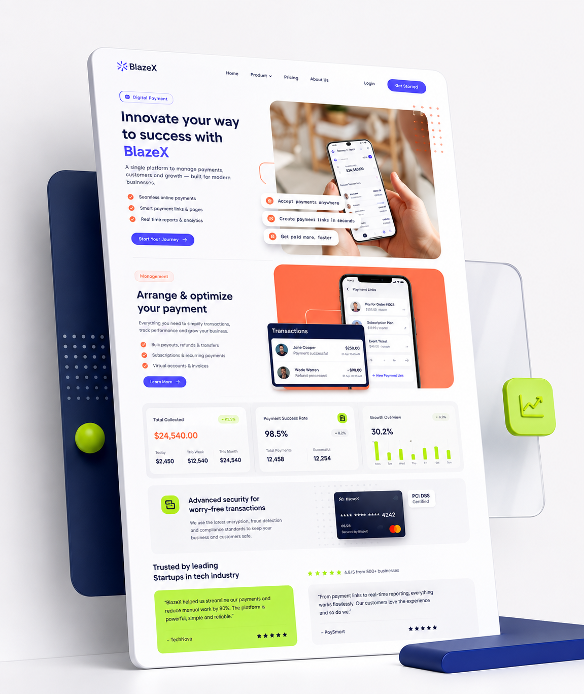
BlazeX is a web platform designed to help businesses collect customer feedback and turn it into useful insights. The design focuses on communicating the product value clearly while making the journey from creating an account to connecting a website and collecting feedback simple and approachable.

Role

Product & UI Designer

Focus

Landing page design, product communication, responsive layouts, user flow clarity

Tools

Web Product · SaaS Experience

Problem

Businesses need a simple way to collect customer feedback without creating unnecessary friction for either the business or its customers. The product also needed to communicate its value quickly and make the initial setup process easy to understand.

Approach

I focused on creating a clear service discovery experience with intuitive navigation, recognizable service categories, provider verification cues, ratings, reviews, and straightforward calls to action. The experience was designed to work consistently across web and mobile touchpoints.

Outcome

I focused on creating a clean visual hierarchy, clear calls to action, and a straightforward three-step product journey: creating an account, connecting a website, and collecting feedback. Supporting sections were structured to explain the product benefits and features without overwhelming the user.

Design Preview

This is a selected mockup and visual glimpse of the BlazeX project. It highlights the overall visual direction, responsive layout, product sections, and interaction structure. View the full project and additional design work through my portfolio.

View Full Portfolio
admin dashboard

Case Study 03

E-Commerce Dashboard — Store Management

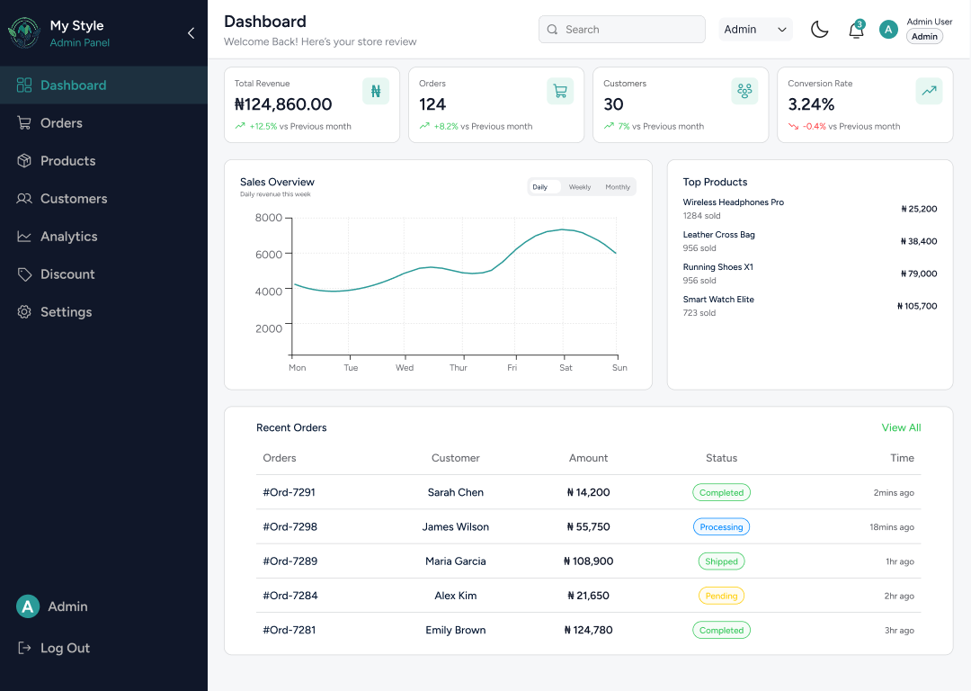
A responsive e-commerce administration dashboard designed to give store owners a clear overview of sales, orders, customers, products, and performance. The interface brings key business information into one structured workspace so users can quickly understand store activity and take action.

Role

Product & UI Designer

Focus

Dashboard UX, information hierarchy, data visualization, responsive interface

Tools

E-Commerce · Admin Dashboard

Problem

Store administrators need to monitor important business activity without having to navigate through multiple screens. The challenge was to organize revenue, orders, customers, products, and performance information into a dashboard that could be understood quickly.

Approach

I structured the interface around the information users are most likely to need first, placing key metrics at the top followed by sales trends, top products, and recent orders. Clear navigation, consistent cards, status indicators, and visual hierarchy help separate different types of information while keeping the dashboard easy to scan.

Outcome

The resulting dashboard provides a structured overview of store performance, allowing administrators to quickly review revenue, orders, customers, conversion activity, product performance, and recent transactions from a single interface.

Design Preview

This is a selected dashboard mockup and visual glimpse of the project. It highlights the interface structure, information hierarchy, analytics presentation, and core store-management elements. Explore the full collection of my design work through my portfolio.

View Full Portfolio
Base 360 AI

Case Study 04

Base360 — AI Customer Conversion Platform

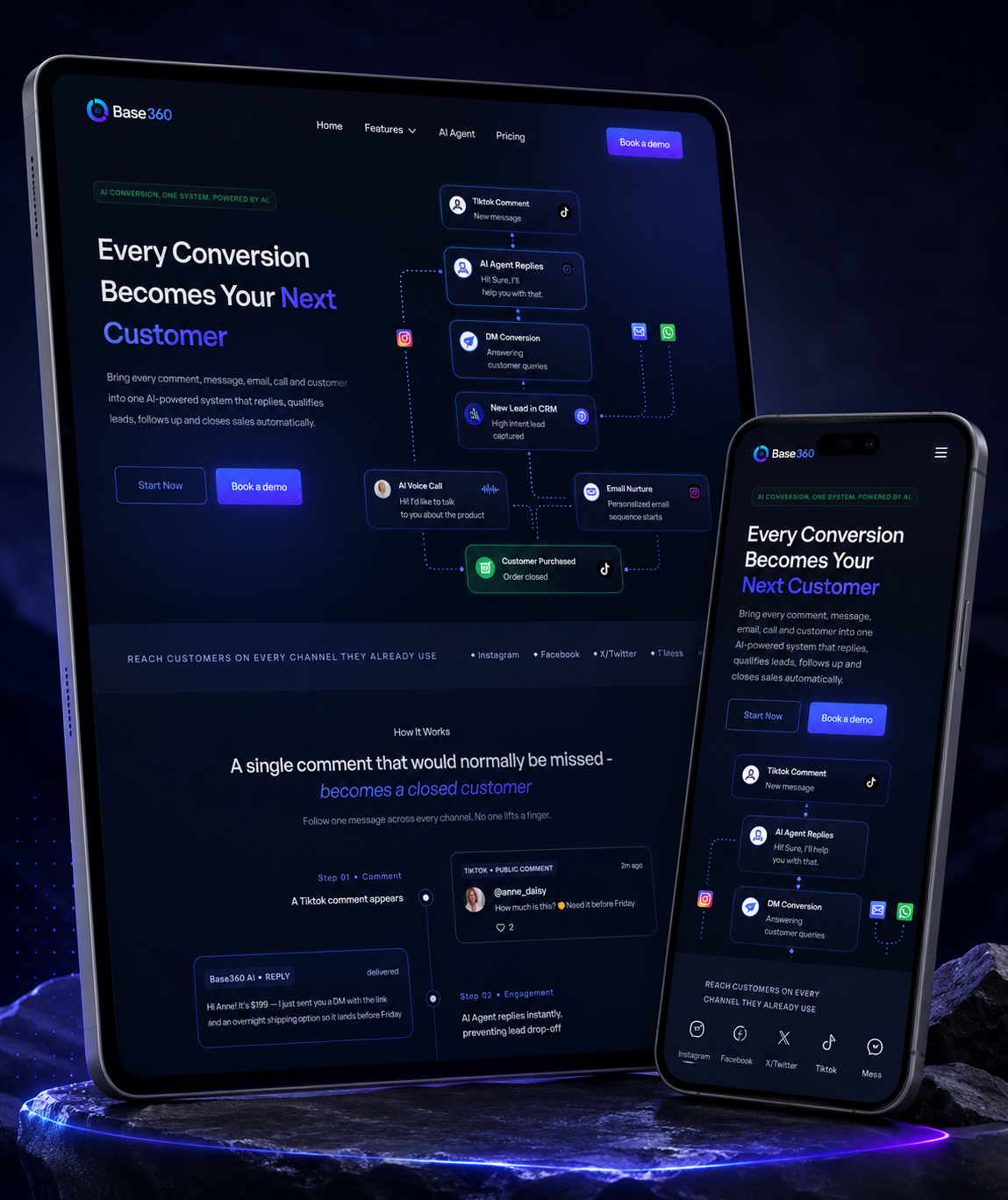
Base360 is an AI-powered customer engagement and conversion platform designed to bring conversations, lead management, automation, and sales workflows into one connected experience. The website communicates this value through a structured product story that takes users from customer conversations to automated engagement and closed sales.

Role

UI/UX Designer

Focus

AI product communication, conversion flows, information hierarchy, responsive web design

Tools

AI SaaS · Marketing Website · Product Experience

Problem

Customer conversations can become fragmented across social channels, messaging platforms, calls, and sales tools. The challenge was to communicate how an AI-powered platform could bring these interactions together while helping businesses respond faster and turn more conversations into opportunities.

Approach

I structured the experience around a clear conversion narrative, showing how a customer interaction can move from an initial comment through AI engagement, CRM capture, voice communication, and ultimately conversion. The interface uses strong visual hierarchy, product cards, workflow storytelling, and focused calls to action to make the platform easier to understand.

Outcome

The resulting experience presents Base360 as a connected AI sales ecosystem rather than a collection of separate tools. The page makes the product journey easier to follow while clearly communicating its major systems, automation capabilities, and customer-conversion value.

Design Preview

This is a selected mockup and visual glimpse of the Base360 project. It highlights the landing-page direction, AI workflow, product structure, conversion journey, and responsive interface. View the full project and additional design work through my portfolio.

View Full Portfolio

Design Critique

Turning interface observations into clear, actionable design feedback.

I evaluate digital interfaces from both a visual and user-experience perspective, looking at hierarchy, usability, consistency, content structure, and overall clarity. My critiques focus on identifying specific issues and translating them into practical improvements rather than relying on subjective opinions.

Interface selected for design critique

Critique Sample 01

KORN — Bakery & Café Website Review

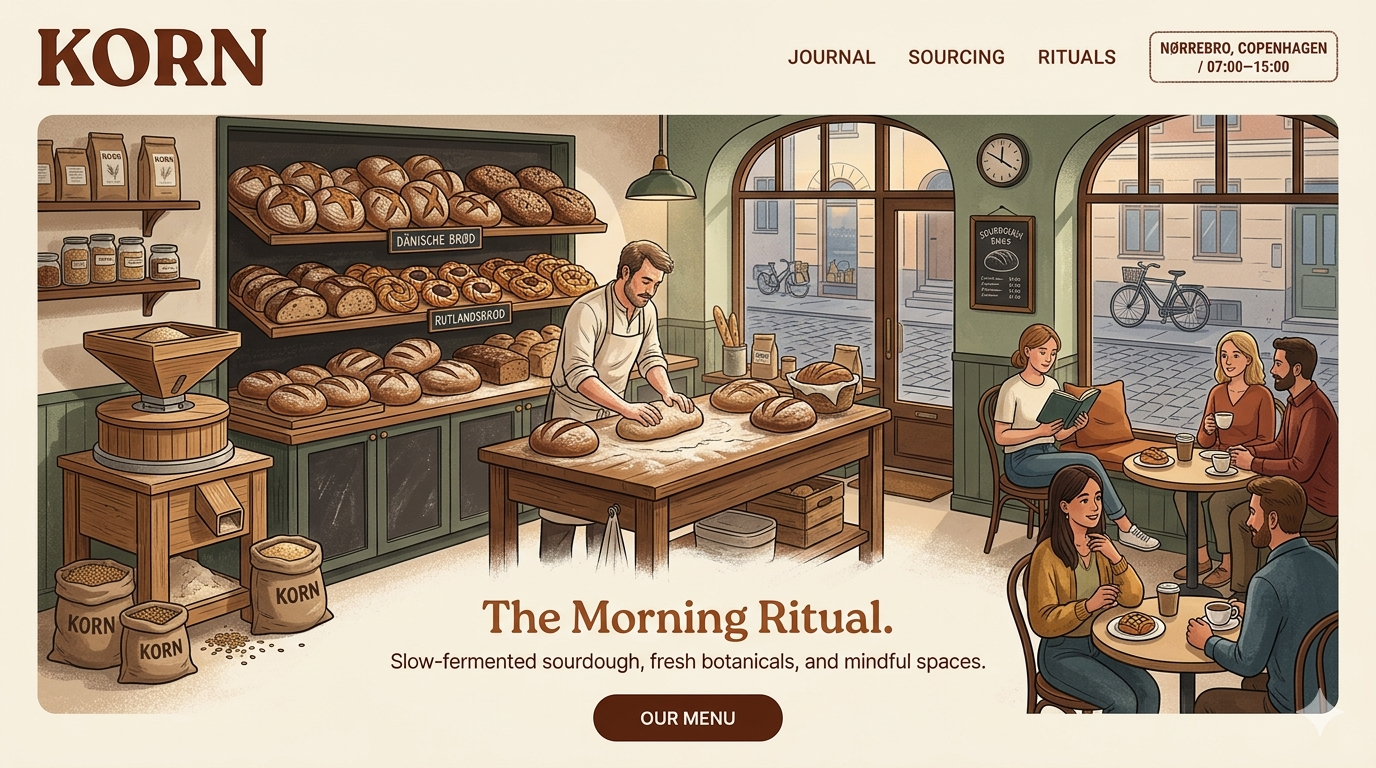
A design critique examining how typography, imagery, layout hierarchy, brand storytelling, and calls to action work together to create a cohesive bakery and café experience while identifying opportunities to improve clarity, consistency, and engagement.

Observation 01

Strong visual identity, but hierarchy competes

The warm color palette, serif typography, and illustrated bakery imagery establish a distinctive personality. However, several elements compete for attention within the hero, making the primary message and supporting information less clearly prioritized.

Recommendation: Strengthen the hierarchy by creating clearer separation between the brand identity, primary headline, supporting message, and call-to-action. Use consistent type scales and spacing to guide the visitor through the content in a deliberate order.

Observation 02

Hero imagery communicates atmosphere effectively

The large bakery illustration immediately communicates the environment, craft, and community behind the KORN brand. The composition creates an immersive first impression, but the amount of visual detail can compete with the text and navigation.

Recommendation: Preserve the illustration as the main visual anchor while introducing stronger contrast or a subtle visual treatment behind important text. This would retain the storytelling value of the imagery while improving readability and message recognition.

Observation 03

Navigation is clear but could communicate stronger priorities

The navigation is intentionally minimal, with Journal, Sourcing, and Rituals providing access to the brand's main content areas. However, the primary conversion action is not immediately obvious from the navigation structure.

Recommendation: Introduce a more prominent primary action such as “View Menu” or “Order Now” while keeping secondary brand content visually understated. This would give users a clearer next step without compromising the editorial character of the design.

Observation 04

Typography reinforces the brand but requires consistency

The combination of bold serif headings and clean supporting text gives the interface a crafted, editorial feel that fits the bakery concept. Some text treatments, however, vary in scale and emphasis, which can make the relationship between sections less predictable.

Recommendation: Establish a consistent typographic system for headings, supporting copy, navigation, labels, and buttons. Maintaining predictable sizing, line height, and spacing would improve scanability while preserving the distinctive editorial personality.

Modern-Bank Analytics Dashboard Review

Interface selected for design critique

Critique Sample 02

Modern-Bank — Analytics Dashboard Review

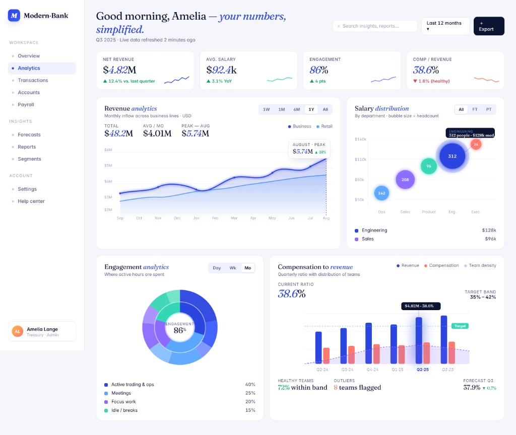
A practical interface review focused on visual hierarchy, dashboard readability, navigation, data presentation, and information density.

Observation 01

Dashboard Hierarchy

The dashboard establishes a clear hierarchy by placing the greeting and key performance metrics at the top before moving into detailed analytics. However, several major data blocks compete for attention once the user moves below the summary metrics.

Recommendation: Introduce stronger visual prioritization between primary, secondary, and supporting analytics so the most important information is easier to scan.

Observation 02

Data density & readability

The analytics area contains multiple charts, legends, labels, filters, and supporting figures within a relatively compact space. This creates a visually rich dashboard but may increase the effort required to quickly understand the data.

Recommendation: Reduce non-essential visual elements and use progressive disclosure where appropriate to keep the primary insight immediately visible.

Observation 03

Navigation clarity

The left navigation separates workspace, insights, and account areas, which provides a useful structure for the product. However, the number of navigation destinations could make prioritization harder as the platform grows.

Recommendation: Group related destinations more deliberately and consider clearer active-state treatment or section hierarchy for faster navigation.

Observation 04

Chart comparison & interaction

The dashboard uses several chart types to communicate revenue, salary distribution, engagement, and compensation data. The variety helps distinguish different datasets, but users may need additional context when comparing information across different visual formats.

Recommendation: Standardize interaction patterns, labeling, and comparison cues across charts so users can interpret different datasets with less mental effort.

Strengths

What I bring to every digital product.

I bring together visual design, user experience, product thinking, and AI-focused evaluation to create and assess digital experiences with clarity, consistency, and purpose.

01

Design Evaluation

Evaluating digital interfaces with a critical eye for hierarchy, usability, consistency, visual clarity, accessibility, and overall experience quality. I turn observations into structured feedback and practical recommendations.

02

UI/UX Design

Designing intuitive web and mobile experiences through thoughtful information architecture, user flows, wireframes, responsive interfaces, visual hierarchy, and polished interaction patterns.

03

Product Thinking

Connecting design decisions to real user and business needs. I focus on understanding the problem behind the interface, simplifying complex journeys, and creating experiences that are useful, clear, and purposeful.

04

AI Rating / Prompt Evaluation

Evaluating outputs for clarity, factuality, usefulness, tone, and alignment with the prompt or task criteria.

05

Collaboration & Communication

Communicating ideas clearly, working effectively with cross-functional teams, receiving feedback constructively, and adapting quickly to different project requirements and working styles.

06

Attention to Detail

Paying close attention to visual consistency, instructions, content quality, and small interface details while maintaining accuracy across repetitive or detail-sensitive tasks.

Experience & Positioning

Design, Product & Evaluation

My experience spans product design, UI/UX, design evaluation, and digital product development. I have worked across remote and international teams, contributing to both the creation and evaluation of digital experiences with a strong focus on clarity, usability, consistency, and quality.

Design Specialist & Design Evaluation

Taste Labs (US) · 2026 – Present

Design Evaluation • Critique • Consensus
  • Evaluate digital design outputs using defined visual, usability, hierarchy and quality criteria.
  • Conduct structured design critiques, explaining design preference and identifying improvements.
  • Participate in consensus labeling workflows to support reliable design evaluation datasets.

UI/UX Designer

Eservone (Canada) · May 2025 – June 2026

Product Design • UI/UX • Mobile & Web
  • Designed user-centered web experiences through wireframes, prototypes and visual iteration.
  • Translated product requirements into clear interface solutions while maintaining consistency across screens.
  • Collaborated with product and engineering stakeholders to improve usability and visual quality.

Product & UI Designer

Invateo Global (Remote) · November 2023 – April 2025

UI/UX • Responsive Design • Collaboration
  • Designed responsive layouts, interface flows, and visual assets for digital products.
  • Collaborated with engineering teams to refine interaction flows and user-facing experiences.
  • Reviewed design iterations and incorporated feedback to improve consistency, usability, and product quality.

UI Designer

Perkinson X (Remote) · August 2022 – October 2023

UI Design • Research • Interface Design
  • Designed website layouts and supported user research to inform interface decisions.
  • Produced interface concepts and design documentation based on project requirements and user needs.

Core Capabilities

UI/UX Design Design Critique Prompt Evaluation Figma HTML/CSS UX Research User-Centered Design Responsive Web Design Visual QA Product Thinking

Contact

Let’s create better digital experiences together.

I’m open to opportunities across UI/UX and product design, web and mobile design, design evaluation, AI training, and prompt-focused work. I’m especially interested in collaborating with teams that value thoughtful design, clear communication, and meaningful digital experiences.

Email

Faridaayelabegan@gmail.com

Tel

+2348147852393